![]() Many people remember the scene in the movie This is Spinal Tap where the character played by Christopher Guest, Nigel is explaining to Rob Reiner that his amplifiers have the ability to be louder than any other amplifier, showing him that they go to “11” on the dial instead of the usual ten. Rob Reiner asks why they don’t just adjust each notch on the dial so each is just a little louder and have it just go to ten like everyone else, and Nigel looks at him as if he’s a complete idiot (a moment of thick irony) and reminds him “but these go to eleven.”
Many people remember the scene in the movie This is Spinal Tap where the character played by Christopher Guest, Nigel is explaining to Rob Reiner that his amplifiers have the ability to be louder than any other amplifier, showing him that they go to “11” on the dial instead of the usual ten. Rob Reiner asks why they don’t just adjust each notch on the dial so each is just a little louder and have it just go to ten like everyone else, and Nigel looks at him as if he’s a complete idiot (a moment of thick irony) and reminds him “but these go to eleven.”
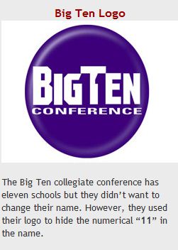
 So when I recently saw this blog entry “25 logos with hidden messages” out at graphicdesignblog.org, I saw the FedEx logo that I often talk about with the hidden arrow, and I also saw the new logo for the Big Ten college sports conference I couldn’t help but laugh a little. And I expect Nigel would also crack a grin.
I am a medium sports fan, so I was aware that Penn State was added to the Big Ten conference making a conference of eleven, and I remembered thinking it would just become the big 11, no big deal.
Not so much according to this blog posting. Evidently they felt there was so much brand equity in Big Ten they couldn’t change to Big Eleven (I actually think it would be written Big11 if they were to follow Strunk and White).
So their idea of a solution was to put the number 11 in the middle of the logo, almost like columns holding up the “T” in ten. Umm. Really? Wow. That’s “truth is stranger than fiction” funny.
Luckily, Penn State is a big program, so I am sure there was no debate about fractions, like a Big Ten and a Half, but to have eleven schools in a group that is honestly all about the schools, I think it sends a pretty bad message all around about the intelligence of the conference. I vote they rethink the name and have it be Big11. Otherwise it’s the conference of 11 schools known as the Bit Ten, and that’s just not thinking.
Maybe we should ask Nigel what he thinks.
-Ric


