The old adage “if it ain’t broke, don’t fix it” holds up in good times and in bad, but I have found that the opposite (if is broke, don’t fix it) is also a valuable adage, and especially in these turbulent times when investment funds are so precious, it merits some attention.
In organizations large and small, I see people concluding that when something is underperforming or not meeting expectations, they need to invest in it to fix it in some form or another. While it seems like a perfectly logical conclusion, it is often insufficient information to merit an investment, or even a spot on a project prioritization list. And the piece that is missing in the analysis is “cause”, will an improvement in the performance of whatever it is that is “broken” cause an improvement in the overall organization, or even just the area it is a part of? Very often then answer to that question is “no”, and the reason that question is often not asked is because mamy people lack a way of representing their work in a way that enables that conversation.
I find heat mapping to be a very simple way of setting up this conversation.
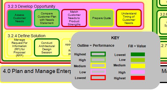
This is an example of a heat map that shows several blocks of work, in this case from the work in developing a sales opportunity. The content is actually not important for this example. In every case, each shape has an “outline” color that indicates how the work’s current Performance, and each shape also has a color for its Value to the organization. There are any number of ways to define performance and value, what’s important is that you define it, and while I have my standard definitions which I am happy to explain, it’s more important to use a consistent definition rather than argue over a best definition. With a good current view of work, it makes it much easier to articulate what it should look like in the future, and from there create a roadmap.
So in this map, section 3.2.3 is Develop Opportunity, and we can read from the colors that Develop Opportunity is bright red, which means it is performing at the “Lowest” of the range, and it is pink for value, which is “High” so since this is a high value underperforming piece of work, it is worth looking into the pieces of work included in Develop Opportunity, and in this case there are five different blocks of work that make up Develop Opportunity. I recently did some work with a group in this same area and a number of people started their conversations saying that the Prepare Quote work, where a price is calculated for the products they sell, should be the number one priority for investment. So I continued to interview people in the group and the heat map is a reflection of their answers to the questions about value and performance (so in that sense it is really a listening tool). When I showed them the results, people were not surprised to see that Develop Opportunity was in need of attention, but when we got to the conversation about what to do to fix it, we looked at Prepare Quote and saw that while its Performance is Medium, it is a Low Value area of work. So when we had the conversation about what would “cause” Develop Opportunity to perform better, based just on this information ( of course plenty more analysis can be done) people saw that improving Prepare Quote was probably not going to have as much impact as something like Match Customer Needs to Product Strengths, which has a Low Performance score and the Highest value score. This is a simple example in a simple spreadsheet, but I would encourage you to try to do some of this on your own to ask what is, and is not likely to be the cause of an improved performance, and if your experiences are anything like mine, you will find yourself saying “if it is broken, don’t fix it.”
Hopefully adding “cause” to the context of your discussions will help you rethink your project selection and prioritization approach.
-Ric

Using the heat map as a common mapping for the stakeholders is an excellent common pictorial display good for solicitation and interaction. However, would tools like Visio and Excell can further get into the quantitative form for Analytics in terms of further decomposition of the business process accompanied by its quantitative assessment. That is in order to see the relative performance and value with respect to other processes deserving possibly more in depth attention, analysis and remedial proceedures…